Performing Analysis of Meteorological Data
Data Scientists and Analysts use data analytics techniques in their research, and businesses also use it to inform their decisions.
Data Analytics gives us plenty of information which is used to analyze everyday weather conditions.It is necessary to have the correct data to get accurate decisions. One type of data that’s easier to find on the internet is Weather data.
Meteorological Data: Data consisting of physical parameters that are measured directly by instrumentation, and include temperature, dew point, wind direction, wind speed, cloud cover, cloud layer(s), ceiling height, visibility, current weather, and precipitation amount.
Objective :
The main objective is to perform data cleaning, perform analysis for testing the Influences of Global Warming on temperature and humidity, and finally put forth a conclusion.
Hypothesis :
The Null Hypothesis H0 is “Has the Apparent temperature and humidity compared monthly across 10 years of the data indicate an increase due to Global warming”
The H0 means we need to find whether the average Apparent temperature for the month of a month say April starting from 2006 to 2016 and the average humidity for the same period have increased or not.
Dataset :
Source URL: https://www.kaggle.com/muthuj7/weather-dataset
Data Analysis :
Code part :
So, let’s get started,
- Importing all the necessary libraries.
import numpy as np
import pandas as pd
import matplotlib.pyplot as plt
import seaborn as sns
2. Load and Read Dataset.
data = pd.read_csv('weatherHistory.csv')
data.head()
3. Dimensions of dataframe.
data.shapeOutput: (96453, 11)
4. Datatypes of the dataframe
data.info()OUTPUT :
<class 'pandas.core.frame.DataFrame'>
RangeIndex: 96453 entries, 0 to 96452
Data columns (total 11 columns):
 #   Column                    Non-Null Count  Dtype
---  ------                    --------------  -----
 0   Formatted Date            96453 non-null  object
 1   Summary                   96453 non-null  object
 2   Precip Type               95936 non-null  object
 3   Temperature (C)           96453 non-null  float64
 4   Apparent Temperature (C)  96453 non-null  float64
 5   Humidity                  96453 non-null  float64
 6   Wind Speed (km/h)         96453 non-null  float64
 7   Wind Bearing (degrees)    96453 non-null  int64
 8   Visibility (km)           96453 non-null  float64
 9   Pressure (millibars)      96453 non-null  float64
 10  Daily Summary             96453 non-null  object
dtypes: float64(6), int64(1), object(4)
memory usage: 8.1+ MB
5. Statistical details of the dataframe
data.describe()
6. Handling missing values
#Check for missing values
data.isnull().sum()OUTPUT:
Formatted Date                0
Summary                       0
Precip Type                 517
Temperature (C)               0
Apparent Temperature (C)      0
Humidity                      0
Wind Speed (km/h)             0
Wind Bearing (degrees)        0
Visibility (km)               0
Pressure (millibars)          0
Daily Summary                 0
dtype: int64
7. Pairwise correlation of all columns in the data frame
Correlation matrices are an essential tool of exploratory data analysis. Correlation heatmaps contain the same information in a visually appealing way. We can display the pairwise correlation using corr() function which creates the correlation matrix between all the features in the dataset.
Heatmap
plt.figure(figsize=(10,8))
sns.heatmap(data= data.corr(), annot=True)
plt.title("Pairwise correlation of all columns in the dataframe")
# save the figure
plt.savefig('plot6.png', dpi=300, bbox_inches='tight')
plt.show()
8. Change the ‘Formatted Date’ feature from String to Datetime using the datetime() function.
data['Formatted Date'] = pd.to_datetime(data['Formatted Date'], utc=True)9.Formatted Data
data = data.set_index("Formatted Date")
data
OUTPUT :

- Now, we have hourly data, we need to resample it to monthly.
- Resampling is a convenient method for frequency conversion.Object must have a datetime like index
10. By Resampling, Create new DataFrame only for Apparent Temperature and Humidity
df_column = ['Apparent Temperature (C)', 'Humidity']
df_monthly_mean = data[df_column].resample("MS").mean() #MS-Month Starting
df_monthly_mean.head()
OUTPUT:

“MS” denotes Month starting.We are displaying the average apparent temperature and humidity using mean() function.
11 .Exploratory Data Analysis
Given:
The Null Hypothesis H0 is “Has the Apparent temperature and humidity compared monthly across 10 years of the data indicate an increase due to Global warming”.
The Alternative Hypothesis H1 is “Has the Apparent temperature and humidity compared monthly across 10 years of the data not indicate an increase due to Global warming”.
sns.set_style("darkgrid")
sns.regplot(data=df_monthly_mean, x="Apparent Temperature (C)", y="Humidity", color="g")
plt.title("Relation between Apparent Temperature (C) and Humidity")
# save the figure
plt.savefig('plot1.png', dpi=300, bbox_inches='tight')
plt.show()
OUTPUT:

Observation: There might be Linear Relationship between “Apparent Temperature ©” and “Humidity” with negative slope.
12. Correlation between Apparent temperature & Humidity
# Pair plot for correlation of Apparent temperature & Humidity
sns.set_style(“darkgrid”)
plt.figure(figsize=(4,4))
plt.title(“Correlation between Apparent temperature & Humidity”)
sns.heatmap(data= df_monthly_mean.corr(), annot=True)
plt.show()
13.
sns.pairplot(df_monthly_mean, kind='scatter')
# save the figure
plt.savefig('plot8.png', dpi=300, bbox_inches='tight')
plt.show()
14. 2D Scatter Plot with Color Coding for each Summary type
sns.set_style("darkgrid")
sns.FacetGrid(data, hue="Summary", height=10).map(plt.scatter, "Apparent Temperature (C)", "Humidity").add_legend()
plt.title("2D Scatter Plot with Color Coding for each Summary type")
# save the figure
plt.savefig('plot3.png', dpi=300, bbox_inches='tight')
plt.show()
Observation:
1.There are very few outlier.
2.Mostly Weather is Clear or Partly Cloudy/Rain in Finland.
3.Only few days there has a Light Rain or Dry or Dangerously Partly and partly Cloudy.
15. Univariate Analysis for Apparent temperature
# For Apparent Temperature (C)
sns.set_style("darkgrid")
sns.FacetGrid(data, hue="Summary", height=10).map(sns.histplot, "Apparent Temperature (C)").add_legend()
plt.title("Analysis of Weather Conditions with Apparent Temperature")
# save the figure
plt.savefig('plot4.png', dpi=300, bbox_inches='tight')
plt.show()

16. Univariate Analysis for Humidity:
# For Humidity
sns.set_style("darkgrid")
sns.FacetGrid(data, hue="Summary", height=10).map(sns.histplot, "Apparent Temperature (C)").add_legend()
plt.title("Analysis of Weather Conditions with Apparent Temperature")
# save the figure
plt.savefig('plot5.png', dpi=300, bbox_inches='tight')
plt.show()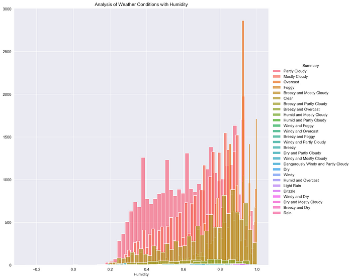
Observation: “Humidity” is better Feature than “Apparent Temperature ©”
17. Function for plotting Humidity & Apparent Temperature for all months
# Function for plotting Humidity & Apparent Temperature for all month
TEMP_DATA = df_monthly_mean.iloc[:,0]
HUM_DATA = df_monthly_mean.iloc[:,1]
def label_color(month):if month == 1:
return 'January','blue'elif month == 2:
return 'February','green'elif month == 3:
return 'March','orange'elif month == 4:
return 'April','yellow'elif month == 5:
return 'May','red'elif month == 6:
return 'June','violet'elif month == 7:
return 'July','purple'elif month == 8:
return 'August','black'elif month == 9:
return 'September','brown'elif month == 10:
return 'October','darkblue'elif month == 11:
return 'November','grey'else:
return 'December','pink'def plot_month(month, data):
label, color = label_color(month)
mdata = data[data.index.month == month]
sns.lineplot(data=mdata,label=label,color=color,marker='o')
def sns_plot(title, data):
plt.figure(figsize=(14,8))
plt.title(title)
plt.xlabel('YEAR')
for i in range(1,13):
plot_month(i,data)
plt.savefig('plot10.png', dpi=300, bbox_inches='tight')
#plt.savefig('plot11.png', dpi=300, bbox_inches='tight')
plt.show()
This function helps to analyze the variations in Apparent Temperature and Humidity for all months over the 10 years.
# Month-wise Plot for Apparent Temperature of 10 years
title = 'Month-wise Plot for Apparent Temperature of 10 years'sns_plot(title, TEMP_DATA)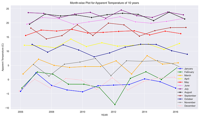
This graph shows the changes in Temperature for each month from 2006 to 2016.
# Month-wise Plot for Humidity of 10 years
title = 'Month-wise Plot for Humidity of 10 years'
sns_plot(title, HUM_DATA)
This graph shows the changes in Humidity for each month from 2006 to 2016.
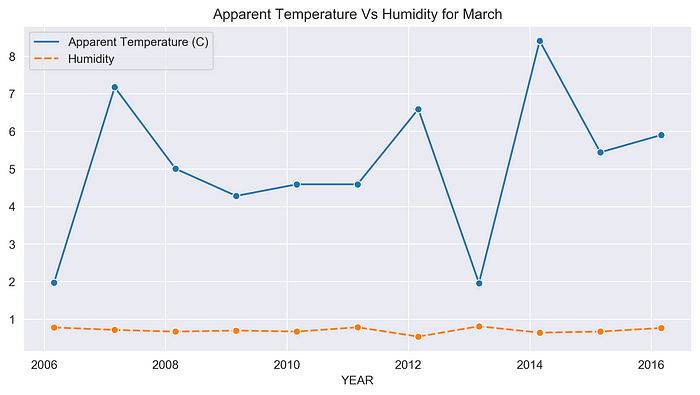
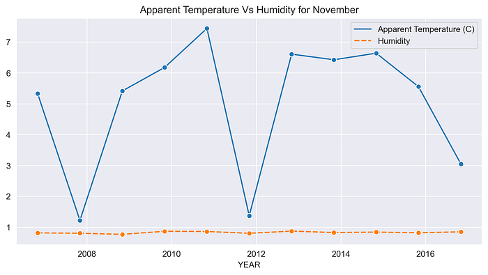
18. Function for plotting Humidity & Apparent Temperature for each month
# Function for plotting Apparent Temperature & Humidity for each monthdef sns_month_plot(month):
plt.figure(figsize=(10,5))
label = label_color(month)[0]
plt.title('Apparent Temperature Vs Humidity for {}'.format(label))
plt.xlabel('YEAR')
data = df_monthly_mean[df_monthly_mean.index.month == month]
sns.lineplot(data=data, marker='o')
name="month"+str(month)+".png"
plt.savefig(name, dpi=300, bbox_inches='tight')
plt.show()# plot for the month of JANUARY - DECEMBER
for month in range(1,13):
sns_month_plot(month)
This function helps to analyze the variations in Apparent Temperature and Humidity for each month over the 10 years.
The graphs below show the variations in Apparent Temperature and Humidity for each month from 2006 to 2016.
January -

February -

March -
April -

May -

June -

July -

August -

September -

October -

November -
December -

Conclusion:
As we can see in the above images, there are many ups and downs in the temperature and the average humidity has remained constant throughout the 10 years.So, We can conclude that global warming has caused an uncertainty in the temperature over the past 10 years.
I am thankful to mentors at https://internship.suvenconsultants.com for providing awesome problem statements and giving many of us a Coding Internship Experience. Thank you www.suvenconsultants.com
Source Code: Github
Connect with me:
LinkedIn: https://www.linkedin.com/in/neha-kumari-09415a16b/
GitHub: https://github.com/neha07kumari